Monday, October 16, 2023

Xena in a Strange Loop

 Xena in a Strange Loop.

Xena fan art from XWP episode Been There Done That, Xena in a Strange Loop

This Xena fan art is based on story of one of the episodes of TV series Xena: Warrior Princess (XWP) titled Been There, Done That (Ep2 of Season 3).   


The story 

The plot of this XWP episode can be seen as the parody of 1993 film Groundhog Day with a twist of Romeo and Juliet

The 3 protagonists: Xena, Gabrielle and Joxer, are trapped in a town in which the day is repeating itself over and over, and Xena realizes that she is the only one who's aware of the situation. Gabrielle and Joxer simply don't remember what happened yesterday or the days before.

Xena is also aware that she has to find out the reason for this excruciating time loop in order to break it. In the end, Xena figures out that the cause is a "Romeo and Juliet" type of tragedy: a young man and a young woman from two feuding families fall in love. Without any hope of being together, the girl decides to take her own life. The boy doesn't want to lose the girl so he pleads with Cupid (God of love). Cupid cannot revive the girl, but grants a wish to the young man -- tomorrow (the day the girl dies) never come. So the girl's last day starts to repeats.

Xena then manages to save the girl with her chakram, and the time loop finally breaks. Tomorrow is a new day! 

The impossible waterfall  

For my fan art, the key point is the time loop in the story. Hence, the core element of my fan art is the "impossible waterfall" -- the paradoxical waterfall that keeps flow in a circle. The waterfall is not part of the XWP story and does not appear in the TV show. I just use it as the visual metaphor for the time loop (the repeating day). 

I borrowed the waterfall design by CJ Edwards from website https://www.moillusions.com/impossible-waterfall-optical-illusion/. 
Impossible waterfall
A simplified version of
a impossible waterfall.
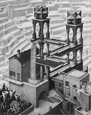
It's a simplified version of M.C. Escher's famous lithograph Waterfall (which in turn is inspired by Roger Penrose's Impossible Triangle).
M C Escher waterfall
Waterfall by M.C. Escher

With such a pre-exist design of vision illusion, it becomes easy to visually describe a time loop. "Time is like a river." One thing common between time and a river is the one directional flow, thus a contradictory loop of waterflow is perfect match for an absurd loop of time. 

I titled this fan art Xena in a Strange Loop. 

Strange Loop is a concept proposed by Cognitive scientist and philosopher Douglas Hofstadter. In his famous book Godel, Escher, Bach, Hofstadter gives many examples of the strange loop, including Escher's artwork Waterfall. He further elaborated the concept in another book I am a strange loop.  

Hofstadter's books cover broad topics including music, art, Zen etc., but I think the discussion are mainly about mathematics, consciousness, and artificial intelligence. 

My understanding of Hofstadter's ideas are very superficial. However, I am curious whether the "repeating day" in the stories of Groundhog Day and XWP Been There, Done That can also be considered a strange loop. In such a plot, the strangeness come from the  protagonist's memory. 


Friday, October 13, 2023

The brook in the woods: vertical lines and curves

My earlier work that explores the design aspect of landscape digital painting, 

also a balance between realistic and abstract representation. 

林间流水话曲直 

digital painting the brook in the woods
The brook in the woods

I did this piece in 2018, painted with Wacom pen (Intuos Small) using Photoshop. The painting is based on a photo I once took in a small park in Toronto ⇩.

photo of a small park in Toronto, early spring
The photo I used for reference


The photo is quite dull. But I was attracted by the early Spring scene: the brook, the bridge, the woods, and the winding road. I believe I can make a good painting with these elements.

My first attempt was a very realistic digital painting that I did with ArtRage, using its color pencil tools. ArtRage does a superb job at simulating different art mediums, be it oil painting, water color, or pencils. I enjoyed the process very much during painting. 
digital painting of the small park with ArtRage
I draw one with ArtRage, not too different from the photo.

However, I felt inadequate when looked at the finished work. It's basically just a simplified version of the photo, even though it got the appearance of an art drawing due to the simulated texture of color pencils. 

One advantage of digital painting is that it's quite easy to start over again. That's what I decided to do, and this time with Adobe Photoshop. Photoshop, with it's versatile brush tools and many other features, offers more flexibility. 

I wanted to put more efforts to design this work. For the new version, I paid more attention to the overall composition than the painting details such as brush strokes, texture, or value of colors.

I decided to make the painting more abstract, but not too abstract that it become unrecognizable. To do this, I retained the major visual elements from my reference photo: the brook, bridge, woods, etc. But I played up with two basic shapes: vertical lines and S-shaped curves. 
sketch for digital painting The brook in the woods
One of my sketches

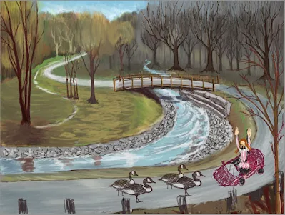
I played a little, just to enhance my composition. For example, I added two pairs of Canada geese on the road, and a car with the driver raising her hands. I wanted to create the visual elements that emphasize the curves and vertical lines.
 

Finally I decided to keep the geese and get ride of the car to make the painting simple. Geese are a familiar sight in the Spring, blend well in this painting.
Pair of geese

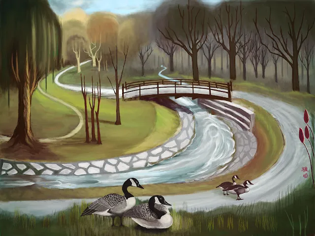
The Brook in the Woods, the final work:
The brook in the woods, digital painting, design of vertical lines and curves

Thursday, October 12, 2023

Mondrian's Pictorial Language

Piet Mondrian's artworks have a very distinctive pictorial language.

His works can be recognized immediately: rectangle shapes, thick vertical and horizontal lines, primary colors (red, yellow, blue), and achromatic black, gray, white. 

Piet Mondrian artwork Composition
Composition with large red plane, yellow, black, grey and blue,
Piet Mondrian, 1921, 
oil on canvas 

Because of the uniqueness of his work, Mondrian has a huge impact on designers. We can find Mondrian's color blocks not only in architectures, but also furniture and fashions, even foods. Just check out pastry chef Caitlin Freeman's Mondrian cake

At first glance, Mondrian's most famous artworks look simple. But if consider the relationship of his shapes, lines, colors, that's actually quite complicated. A typical Mondrian painting would look both dynamic and harmonious at the same time. Mondrian obviously pursuits an asymmetrical balance. He once said: "Plastic art affirms that equilibrium can only be established through the balance of unequal but equivalent oppositions." 

As we learn from art history, Mondrian's art style evolved step by step, from realistic to abstract, from complex to simple. Mondrian once said: "Pure abstract art becomes completely emancipated, free of naturalistic appearances." 

Piet Mondrian artwork Avond the red tree
Avond (Evening): The red tree, 1910

Piet Mondrian artwork gray tree
Gray Tree, 1911

Piet Mondrian artwork Pier and Ocean
Composition No. 10: Pier and Ocean, 1915

Mondrian's works were not just abstract, but formed a set of pictorial language, followed a very strict grammar. For example, he would only use straight lines at right angle, no circle, no curve, no diagonal lines. 

Mondrian's partner, De Stijil movement cofounder Theo van Doesburg started to use diagonal in his work in 1923, and it turned out this was a huge difference in artistic believes between these two, so much so that the two finally parted their ways. Mondrian maintained his art practices in Neo-Platicism while van Doesburg went on establishing a new art movement called Elementarism.

For Mondrian, the pictorial language of his Neo-Platicism has philosophical foundation and spiritual implication. He said: "All relations are dominated by a single primordial relations, which is defined by the opposition of the two extremes."

He also said: "Vertical and horizontal lines are the expression of two opposing forces ... They exist everywhere and dominate everything; their reciprocal action constitutes 'life'."

References:

- Dr. Stephanie Chadwick, "Mondrian, Composition with Red, Blue, and Yellow," in Smarthistory, April 27, 2016, accessed June 19, 2023, https://smarthistory.org/mondrian-composition-ii-in-red-blue-and-yellow/.
- The Art Story: Neo-Plasticism 
- The Art Story: Piet Mondrian 

Wednesday, October 11, 2023

Birds on Abstract Art

Realistic birds on abstract Modern art background.

I want to design a group of images with realistic arts and abstract arts mingled together. 

I drew a group of birds in flat color with Adobe Illustrator, and try to put them on different styles of abstract Modern Arts. 

birds on abstract art background, small


Dove on Cubism style art

dove and Cubism art, realistic art and abstract modern art
Imagine a bird flies in a big city. One minute it stands on a curb at street level, next minute it lands on a building rooftop. The bird's viewpoints keep changing. 

Using multiple vantage points to depict a scene is one of the major characteristics of Cubism art. For my series of Birds on Abstract Art, I think it's a perfect match between a city dove and Cubism style art. I particularly use Juan Gris (1887-1927)'s paintings as my references.

Robin on Kandinsky style art

robin bird on Kandinsky art, realistic art and abstract modern art
American robin is one of our favorite songbirds. Robins not only call, but sing (Check The Cornell Lab website for robin's musical songs). 

The songs of robin remind me of Wassily Kandinsky (1866-1944)'s abstract arts. Among Modern abstract painters, Kandinsky is famous for linking his works with music. 

Cardinal on Mondrian style art

cardinal bird on Piet Mondrian style art, realistic art and abstract modern art
Male Northern cardinal is unique in its bright red body color. The almost pure primary color reminds me of Piet Mondrian (1872-1944). 

Of course Mondrian's Neo-Plasticism art has a set of strict rules, including use only straight lines, only horizontal and vertical lines, only primary colors and white, black, and gray.  

When I do this piece, I explored the ways of bending these rules while still maintaining the "Mondrian-ness". 

Sparrow on Matisse cutout style art

House sparrow on Henri Matisse cutout, realistic art and abstract modern art
House Sparrow is quite plain with its muted color. But it's a common sight in cities and very lively. I put a sparrow in contrast with Henri Matisse (1869-1954) style cut-out arts, which is very colorful.


Sunday, October 8, 2023

A piece of PCB art

Raspberry on Printed Circuit Board: 

My first piece of PCB art

Raspberry PCB art, small, design inspired by printed circuit board with a raspberry fruit

Raspberry is no ordinary fruit, thanks to the marvelous little devices called Raspberry Pi. Raspberry Pi is a series of single-board computers, with no monitors and no hard drives. In eyes of a non-tech person like me, they are mainly pieces of small electrical circuit boards, and they have a splendid logo. (See their Instagram

Hence, the fruit raspberry has a strong association with circuit boards, at least in my mind. 

Printed Circuit Boards, or PCB, are not only vital parts for electronics, but also inspirations for artworks. 
printed circuit board of dial up modem
The photo I took a few years ago of an old dial-up modem.
I'm still struck with the visual beauty of its circuit board.


I've always wanted to do a design emulating PCB. For my first try, I decided to put a raspberry on it.

For this work, I have two major decisions to make: 1) which visual elements do I "borrow" from printed circuit boards? 2) how abstract or realistic do I draw my raspberry? 
abstract representation of a raspberry
A more abstract representation of raspberry.

There are all type of PCBs, with all sorts of colors and different levels of complexity. PCBs also keep evolving. For example on older PCBs the capacitors are cylinders extruding from the base while on newer ones they are just tiny blocks lying on the boards. 

For my design, I want to keep the whole image simple, so I just integrated a few visual elements of PCB. I also stick with the color green since green is the conventional color associated with PCBs. As for the raspberry, after several attempts, I decided to put a very realistic fruit image on the chip instead of more abstract ones. 

Here is my design of "Raspberry on Board", my first piece of PCB art. 
PCB art, artwork, graphic design inspired by printed circuit board, with a raspberry fruit on it

"PCB Art" is a relatively new term. It has been used in two ways: 1, refers to art elements on actually functioning circuit boards, and 2, refers to artworks inspired by PCB, which have no functions other than being artworks. My design belongs to the later group of course. 

As a graphic designer, my focus is always on the visual. I even look for inspiration from William Morris's fabric patterns. I shall call my design "PCB art, just art". 

More in this blog